
 Art
How to Explore Islamic Art in Cleveland’s Open Collection
A close-looking guide to a Qur’an folio and luster ceramics, using Cleveland’s public collection records.
Compare a Kashan tile panel and Ottoman calligraphy to see how words occupy different materials and spaces.
Two LACMA objects make an effective introduction to writing as a visual presence. One is a substantial ceramic architectural panel from early fourteenth-century Kashan. The other is a much smaller Ottoman work on paper mounted on wood, signed by Ibrahim Zivar. Comparing them turns “calligraphy” from a broad category into a set of decisions about scale, material, and setting.
The museum’s collection records are the starting point. They give each work a place, date, material, accession number, and curatorial account. Their display indicators can change, so check the current record before building a Los Angeles itinerary around either object.
LACMA identifies its Tile section of a mihrab as early fourteenth-century Kashan fritware with luster painting, cobalt, and turquoise. The curatorial note explains that the surviving section belonged to a larger arrangement. Its suggestion about that arrangement’s original scale is an informed reconstruction, rather than a measurement of a complete structure still standing.
The panel’s writing and plant forms occupy different zones. The museum connects the framing inscription with Qur’anic verses about Paradise and proposes a possible funerary setting. Keep that possibility qualified when describing the object. Tile record
Look at the relation between the letters and the surrounding shape. Some marks can be read as both a written sign and a component in the surface’s rhythm. This does not mean their textual meaning disappears. It means that an inscription can be encountered at several distances, first as an architectural feature and then as words.
The object also invites a question about fragments. What can the surviving portion establish, and what must be reconstructed from comparison? That distinction is part of responsible interpretation.
Ibrahim Zivar’s levha is dated 1784–85. The museum describes opaque watercolor and gold on paper mounted on wood, with interlaced phrases in gold and blue against a dark ground. Its curatorial note explains the use of such mounted calligraphic panels as wall decoration in Ottoman Turkey.
The maker’s signature and the published translation help anchor the work in a particular practice. They also give the viewer information that cannot safely be guessed from an attractive image alone. Levha record
Compare the panel’s dimensions with those of the ceramic work. Imagine each at a plausible viewing distance without asserting its original location. Which details remain legible from across a room? Which require approaching closely? Those questions connect the lettering to a human viewer.
Consider the support as well. A mounted sheet and a ceramic architectural component require different processes and create different relationships between image, surface, and structure.
LACMA’s catalog also includes a carved panel dated to the first half of the ninth century and a calligraphic panel dated to the late fifteenth century. These records provide possible next steps for a study of material and writing. Read their current catalog information before making more specific claims about production or use. Carved panel · Calligraphic panel
A useful personal comparison sheet has four entries, one for each object. Record the material, dimensions, date, named maker where available, and whether the object is a fragment. Add one sentence describing something you can actually see.
Avoid ranking the works by how much decoration they contain. A relatively restrained arrangement can make a word or edge unusually prominent. A dense composition can create a different viewing rhythm. The question is how the design works in its particular format.
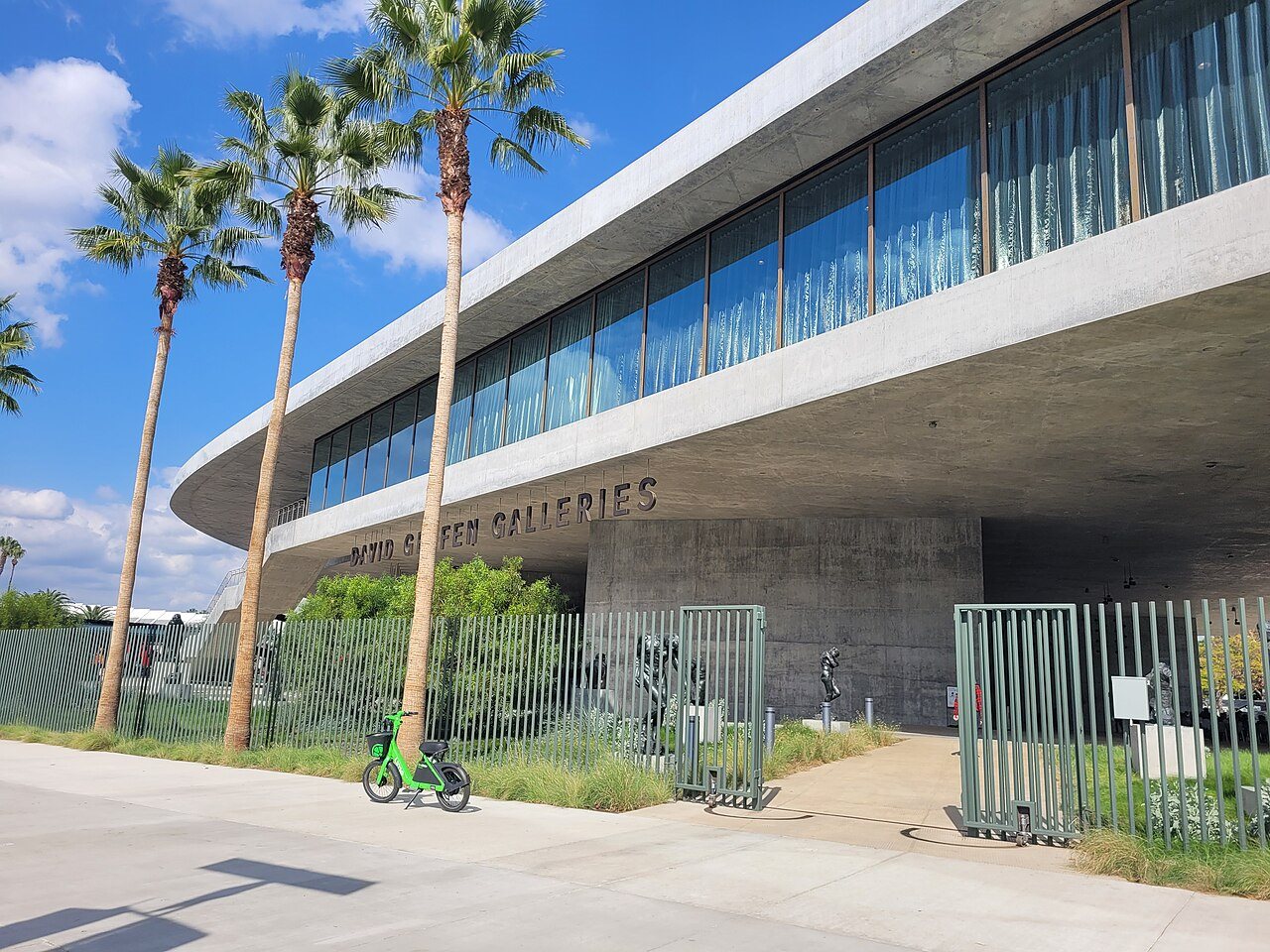
Use LACMA’s visitor information for tickets, access, and gallery conditions. The object records checked for the two main works associated them with the David Geffen Galleries and the theme Art of the Word, Word as Art. Reconfirm that information for your visit.
The photographs in these records carry Museum Associates/LACMA copyright notices. Save the record links for personal research and obtain the applicable permission before using museum images in a commercial publication. A download control alone does not settle the permitted use.
When writing about what you saw, distinguish the museum’s interpretation from your observations. A sentence about the way blue and gold draw your eye can stand as a response. A sentence about the text’s meaning needs an accurate translation and attribution. That habit makes a short account more informative and gives the next reader a dependable route back to the objects.
A small tenth-century Iraqi bowl, accession M.73.5.272, brings the discussion of surface down to the scale of a hand. Its main image is a hare, painted in luster over the glaze. LACMA explains that this technique required two firings: an initial glazed surface followed by a metallic compound applied and fired under restricted oxygen. The result is a thin lustrous layer rather than a solid metal object. That distinction helps explain how humble clay could acquire a luxury surface. Compare the bowl with the architectural tile without assuming their makers used identical recipes. Scale, period, and local production all matter. The collection page identifies the photograph as copyrighted by Museum Associates/LACMA, so its download button alone does not establish permission to republish it. Source
ArtA close-looking guide to a Qur’an folio and luster ceramics, using Cleveland’s public collection records.
 Art
Explore rock crystal, metalwork, manuscripts, and textiles through the Dallas Museum of Art’s Keir Collection records.
 Art
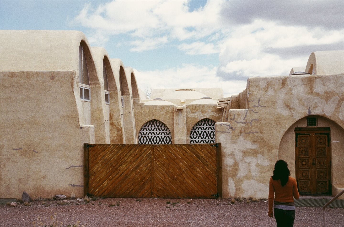
Hassan Fathy’s New Mexico mosque connects Muslim community-building, earthen construction, and a changing vision for life in the American Southwest.